UI / UX
Personal case study where I redesigned the Android layout of BMO app’s Savings Goal function.
UX-focused typography ( line height, hierarchy, groupings, consistency in decimal values )
Layout and adding visual interest ( optimized meter graphic )
Unified color design based on function ( links, icon )
An initial idea I had was to alter the meter so it had more of a ‘gamified’ look and function. However, after perusing more of the app, the narrow meter conformed easily to varied layouts especially those with less white space.
I found the spacing between sections too equally distributed in the original version, as a result, it was difficult to visually identify what section these bits of information pertained to. Increasing the body housing related information gave way to a more organized layout.
Lastly, I did away with the ‘Savings Goal’ text at the top because at first glance it seems like this is in some way connected to the back arrow on the upper left corner. It is in fact an informational header and a standalone piece of text. Since it has no function and the home button at the bottom of the screen takes you back to the menu and the left and right arrows let you toggle between savings goals, it felt unnecessary.
logo design
Logo design for a finance company. The logo and icon went through a series of iterations following stakeholder feedback. Palette was taken from color branding exercises.
Logo prototyping was done in Autodesk Maya and final deliverables were exported as SVG files to ensure highest image quality and cross functional media use.
UI game assets
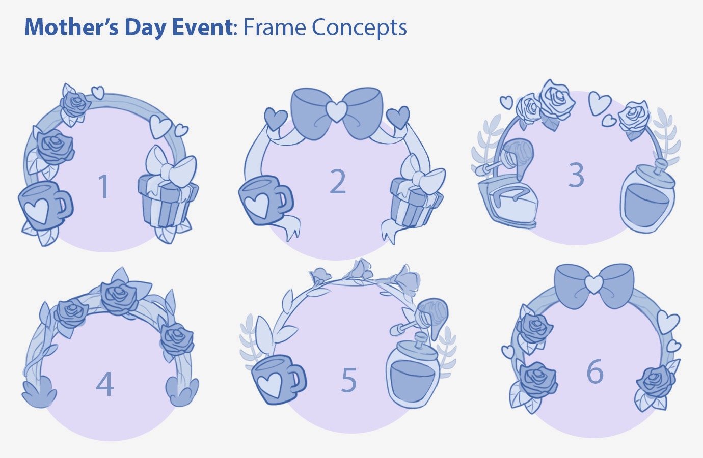
Working alongside Art, Product, UI/UX, Engineering - created UI assets, mock layouts, in-game pop-ups for a Live Game feature. Created for Big Fish Games; Big Fish Casino.
marketing design
Pop-up designs for live ops, email marketing campaigns and social media for MyVegas and MyKonami slots games.
VISUAL DESIGN
I worked directly with the CEO/Founder and VP of Product for a SaaS company with the goal of:
establishing a color scheme to unify design elements with text
reimagining the visual design while preserving brand identity
working with engineering tools to integrate motion design into CSS
Illustration
One of the most fun and rewarding challenges was translating my existing illustration style to conform to the world of web design.
When creating environments, characters and props, my design-sense needed to consider the iconography, gridding, padding of elements to name a few.
iconography
animation & Motion Design
LAYOUT


